Cockatoo Island
Signage & Wayfinding



Medium. Signage & Wayfinding
Client. Cockatoo Island
Title. Signage & Wayfinding
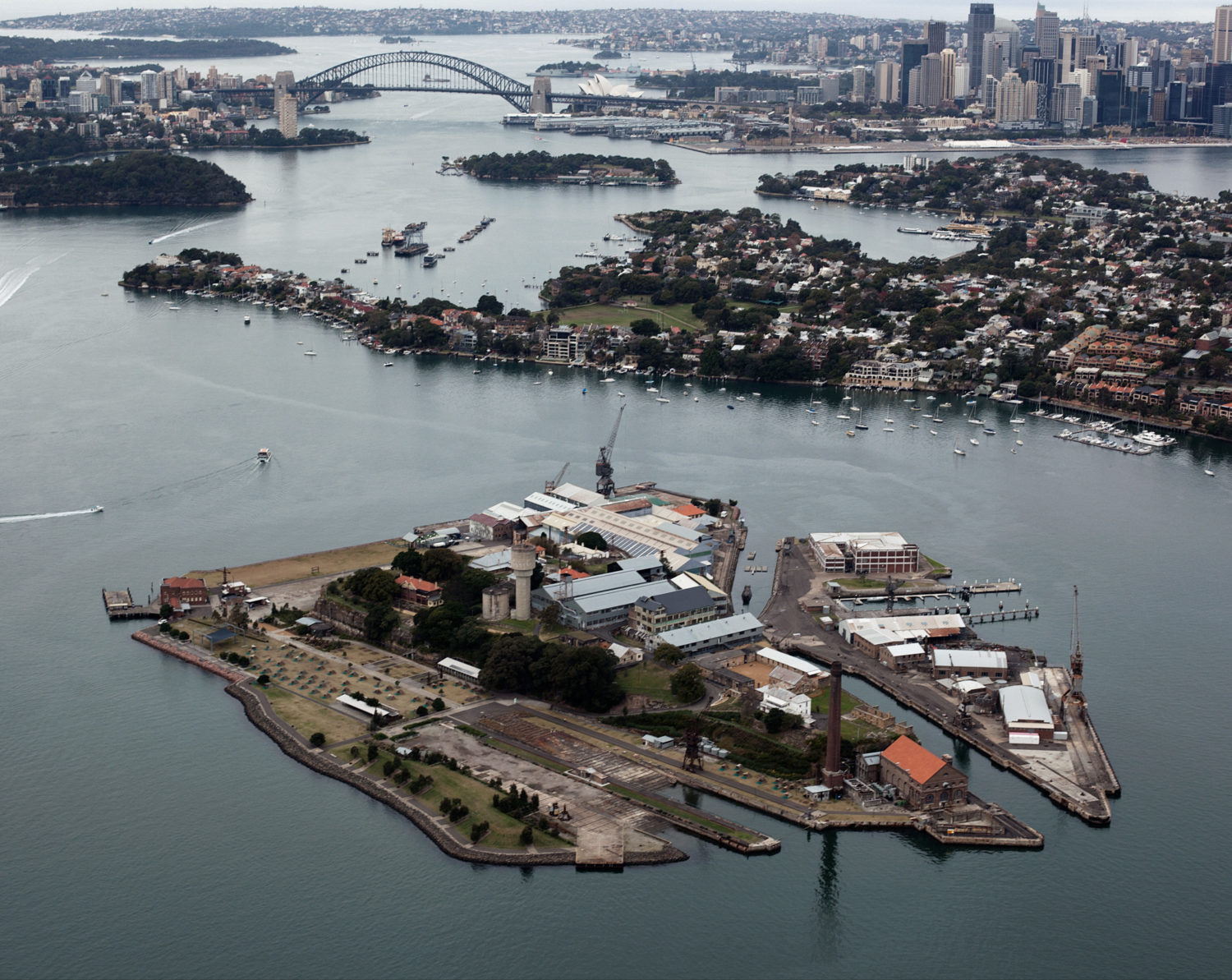
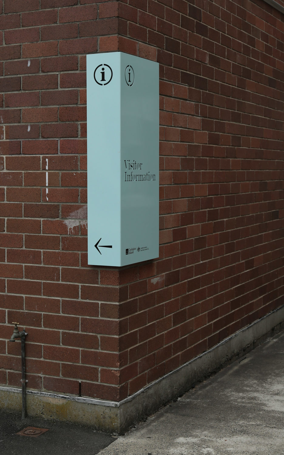
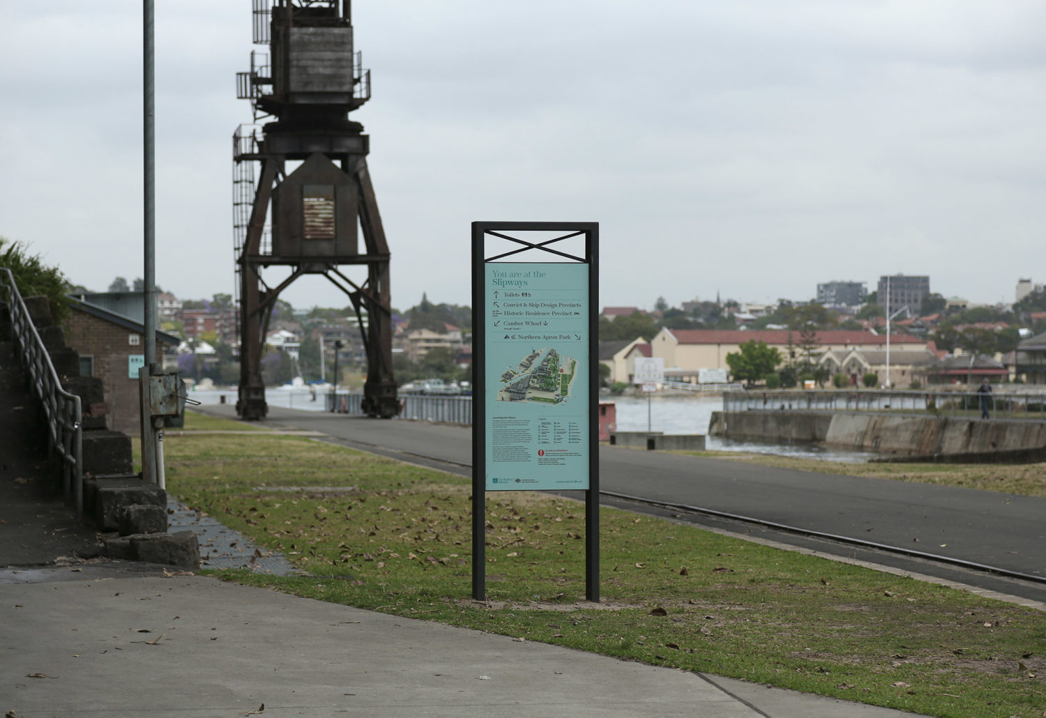
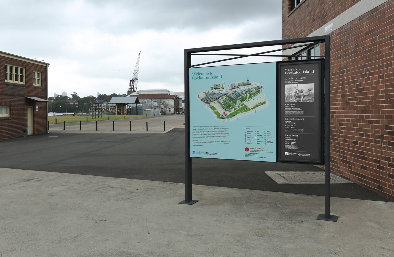
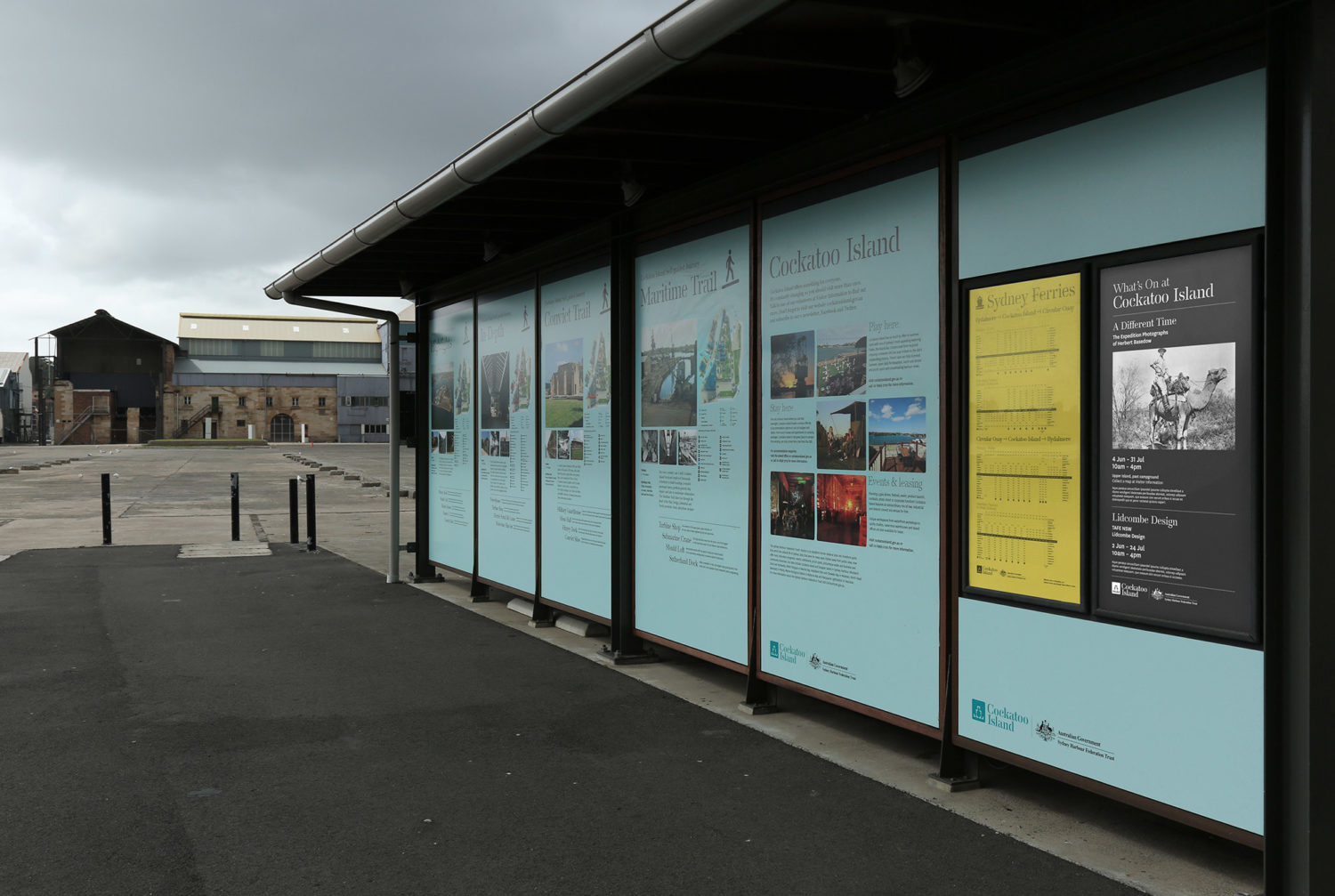
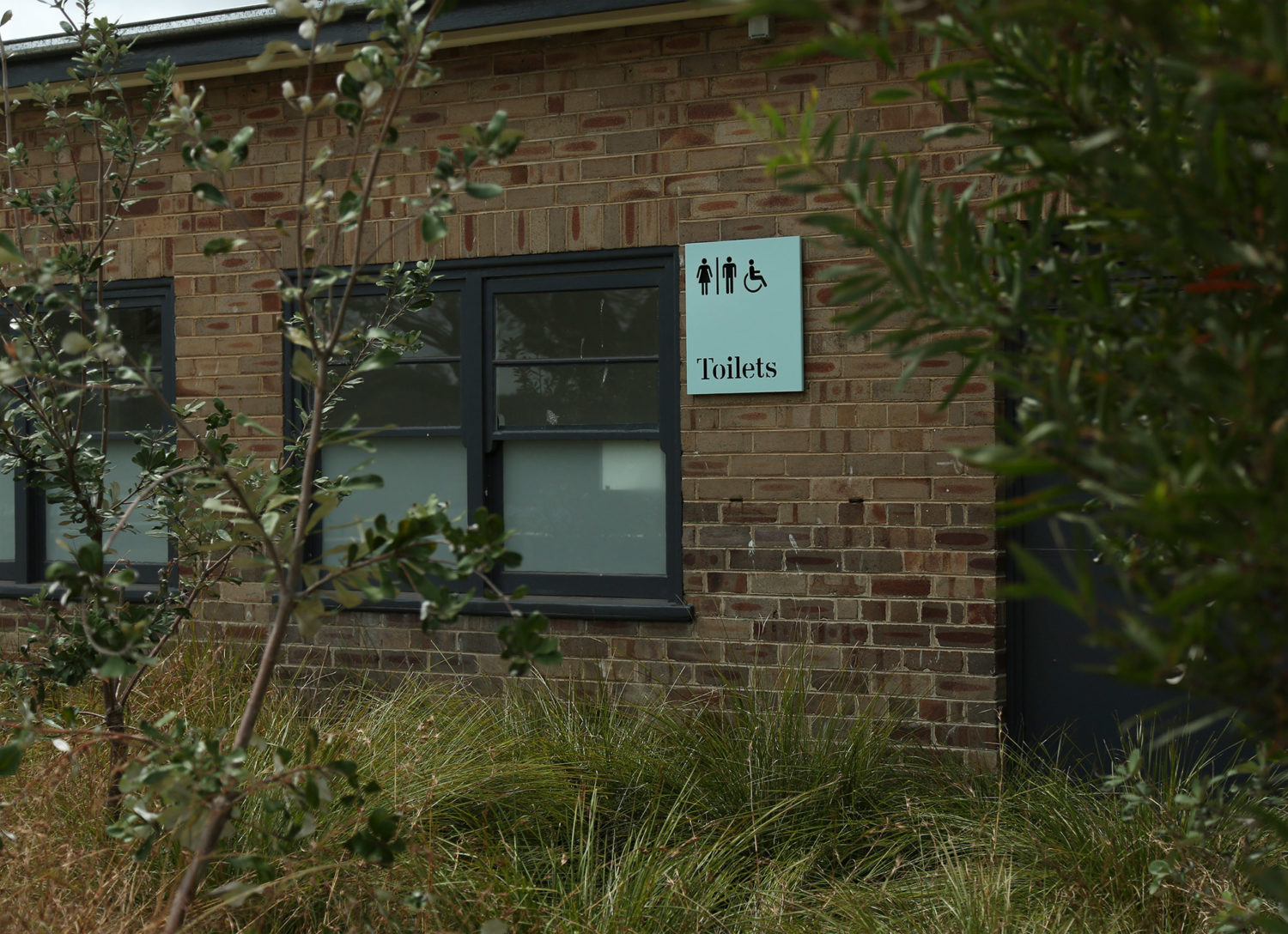
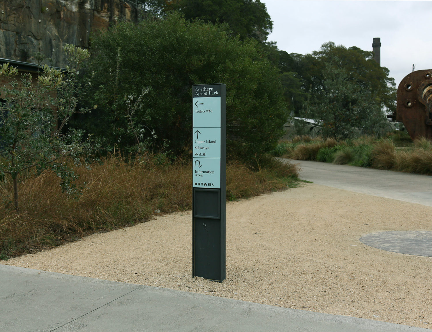
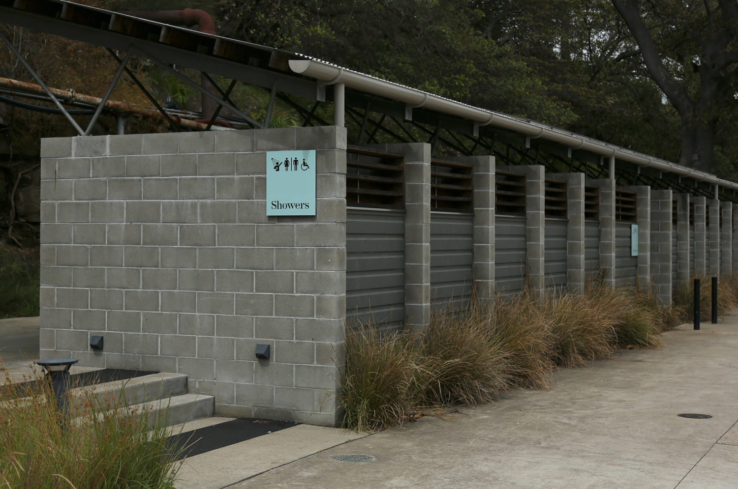
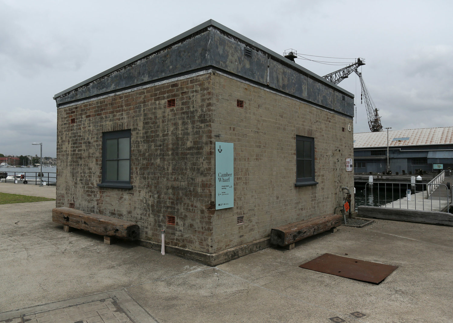
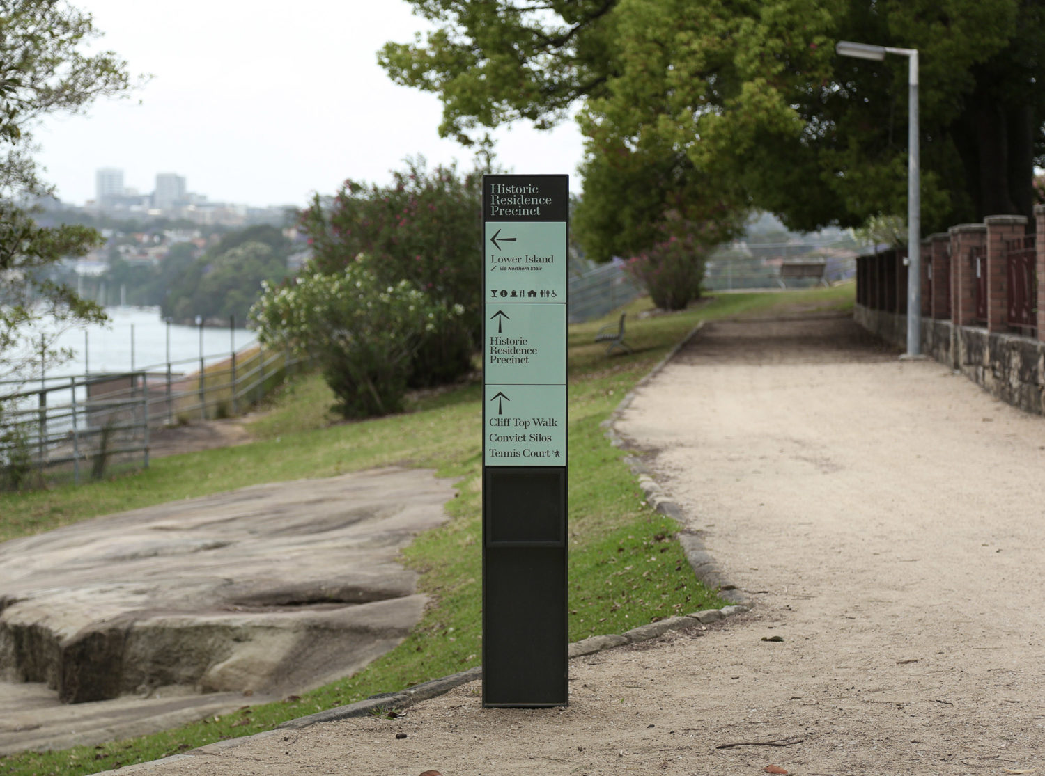
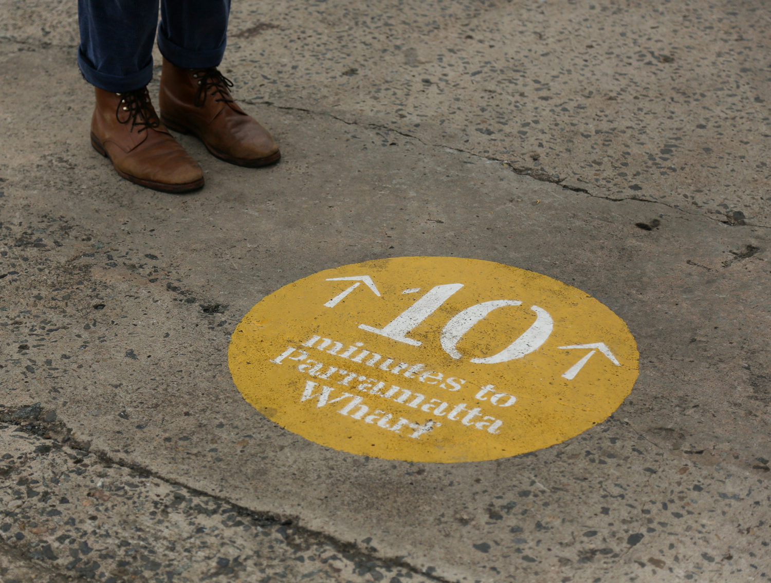
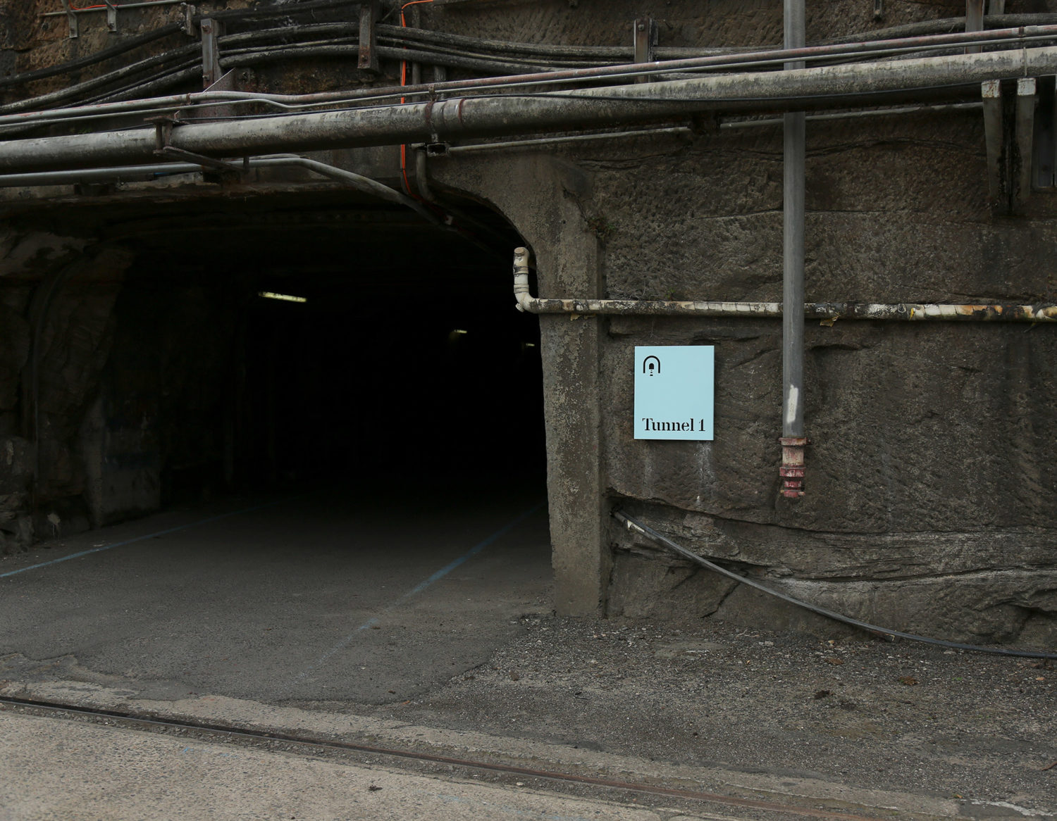
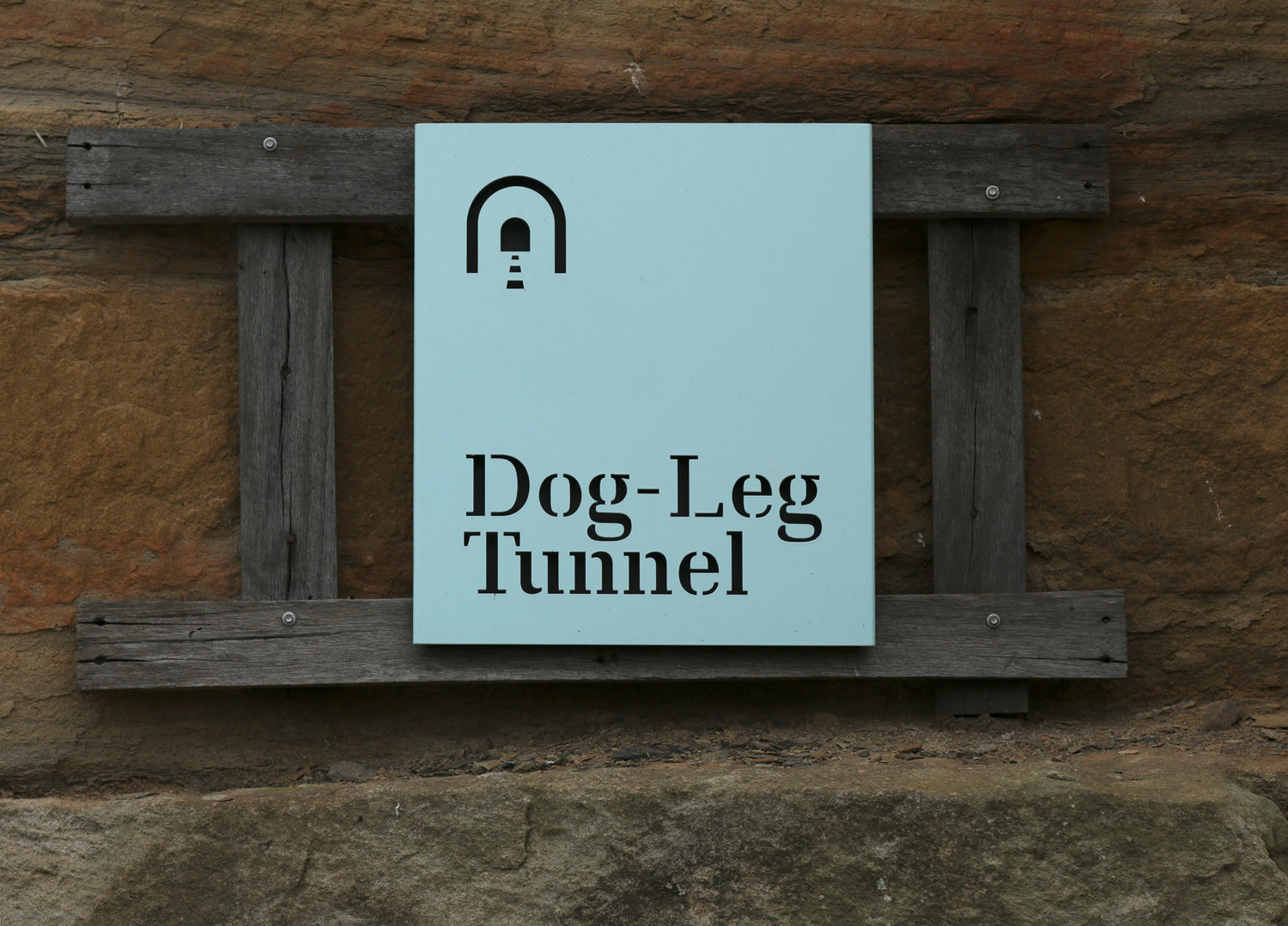
In addition to rebranding Cockatoo Island, Collider also took on the hefty task of implementing a new signage and wayfinding strategy across the island. The new strategy, consisting of over 200 signs, aimed to both improve visitor navigation of the deceptively vast island and also provide better, more concise information, mapping and changeable systems for events.
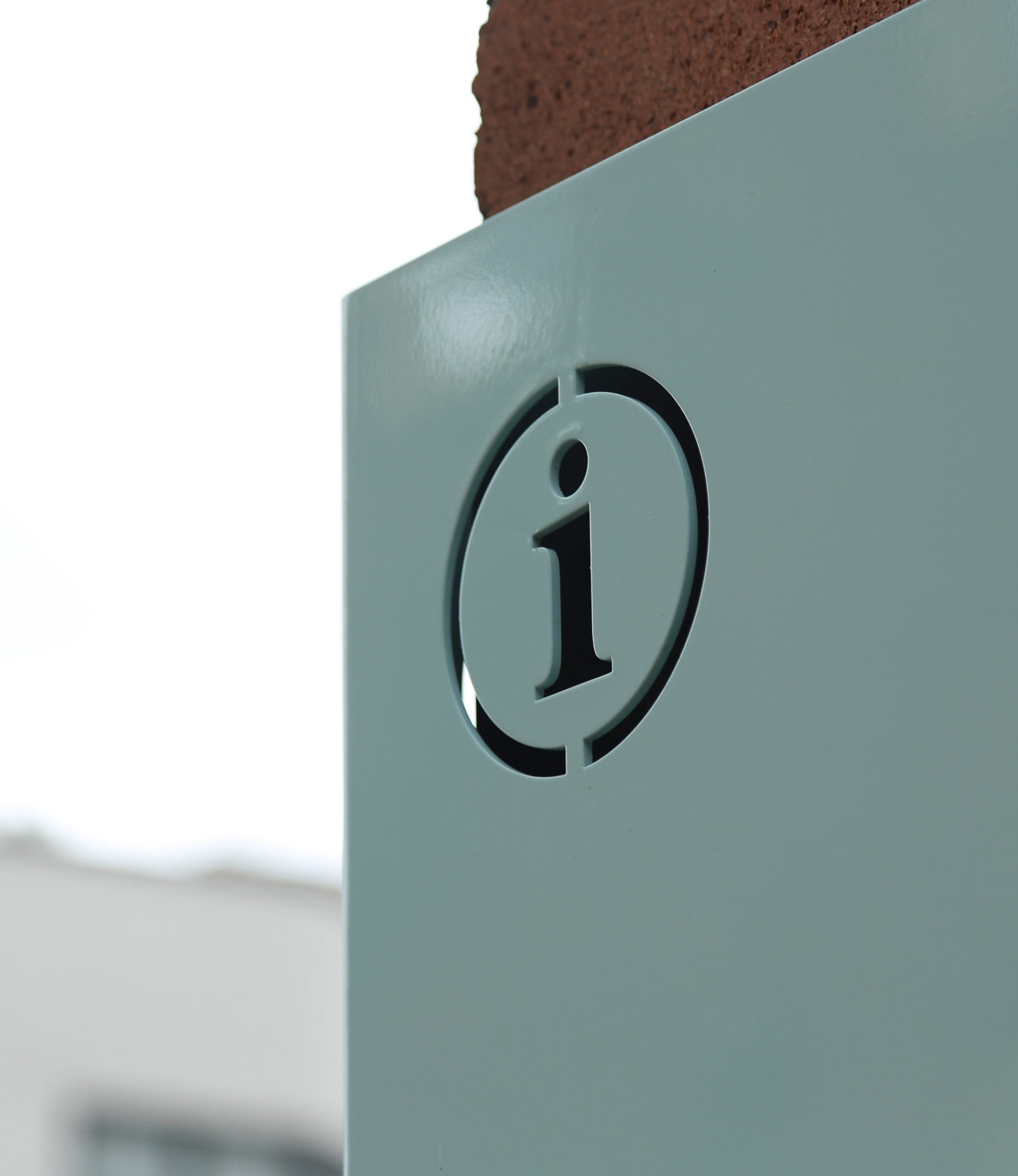
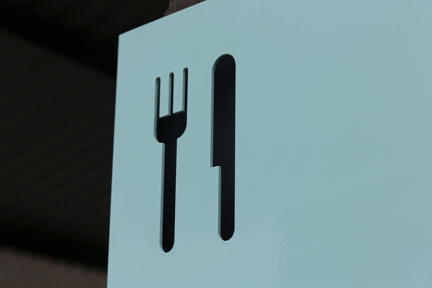
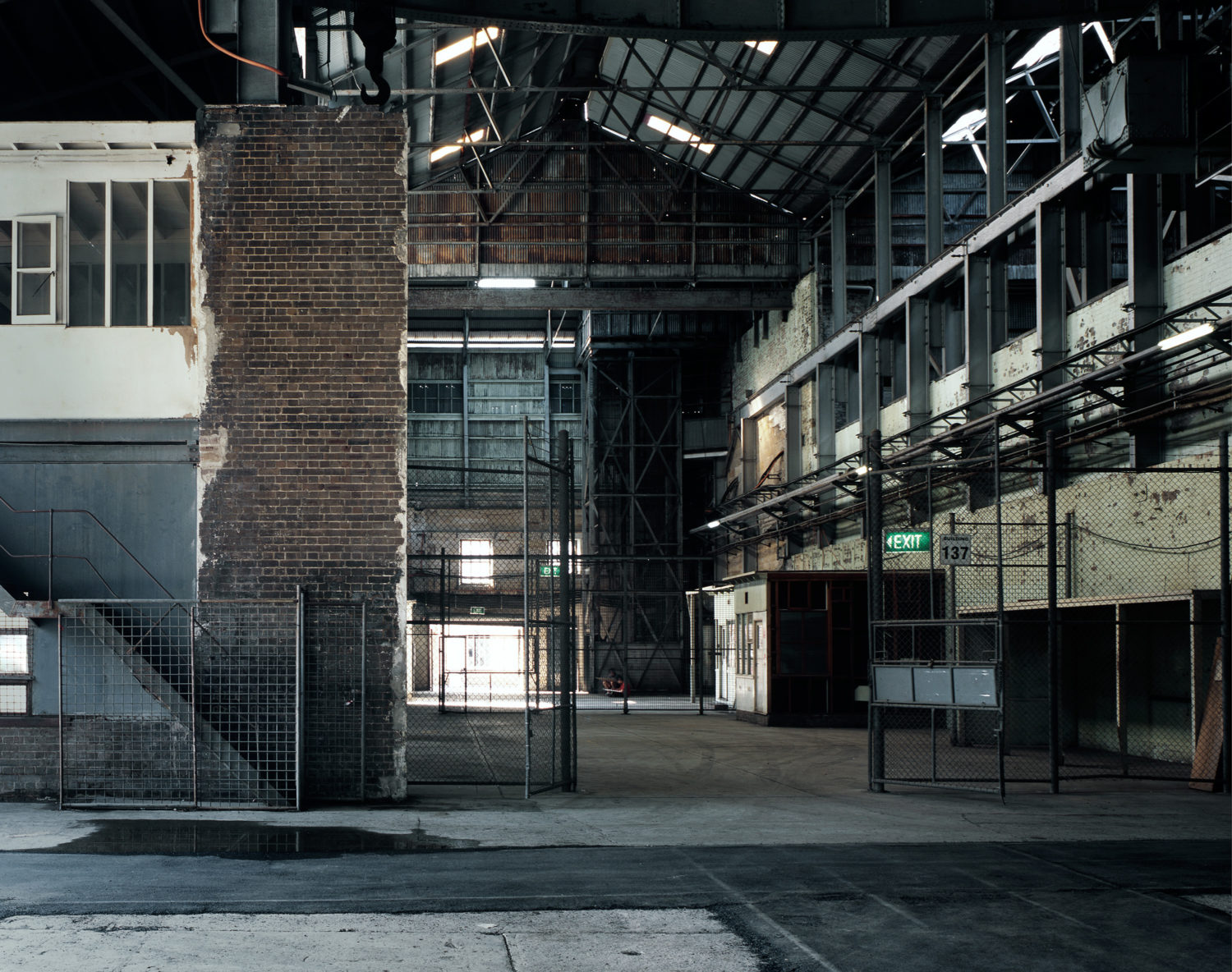
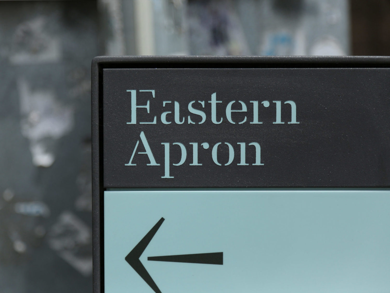
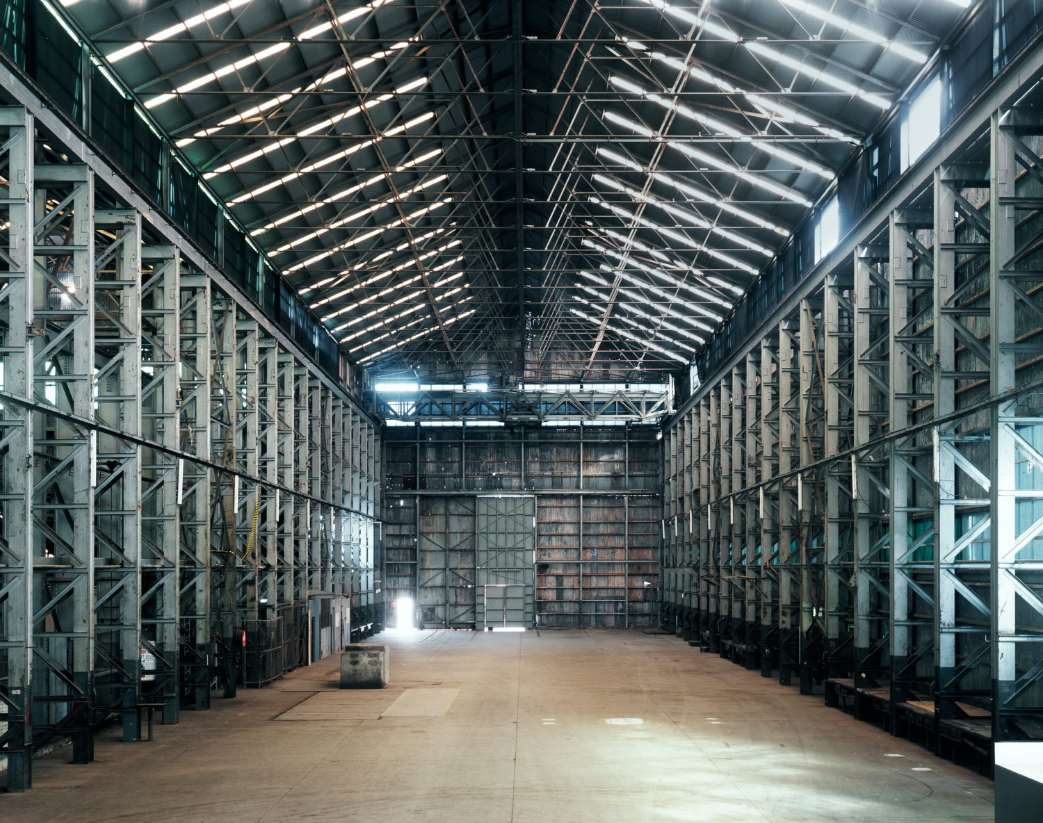
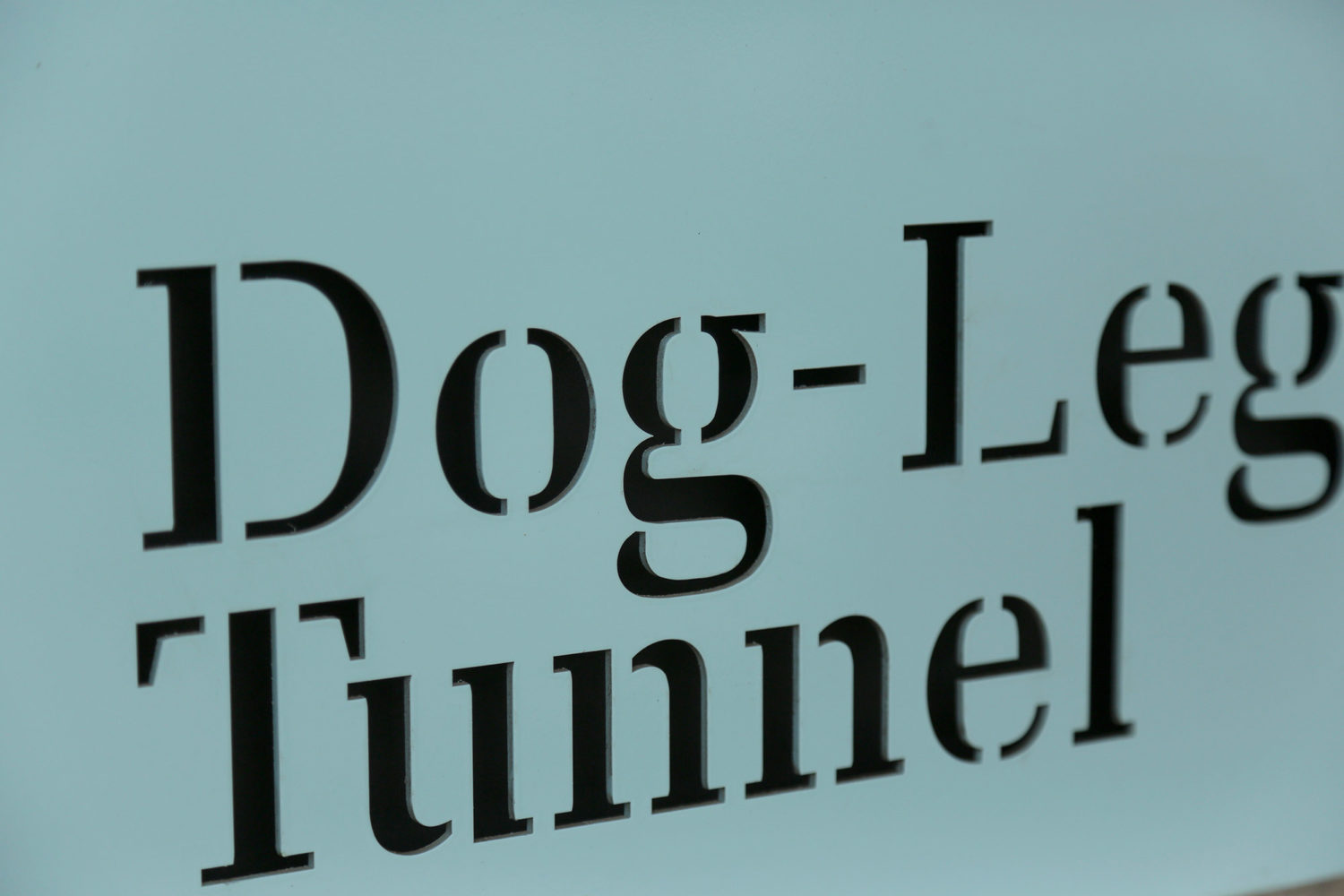
The signage needed to clearly sit apart from the visually busy industrial context whilst being sensitive to the historical nature of the space. We approached the system as though it was an annotation, using clear open panels of type with faded teal (reminiscent in many of the old internal spaces) to sit clearly removed from the setting. One of the reasons the key typeface was chosen was for its ability to be laser cut out of metal panels providing interesting detail in keeping with the nuances of the architecture and industrial machinery found across the island.
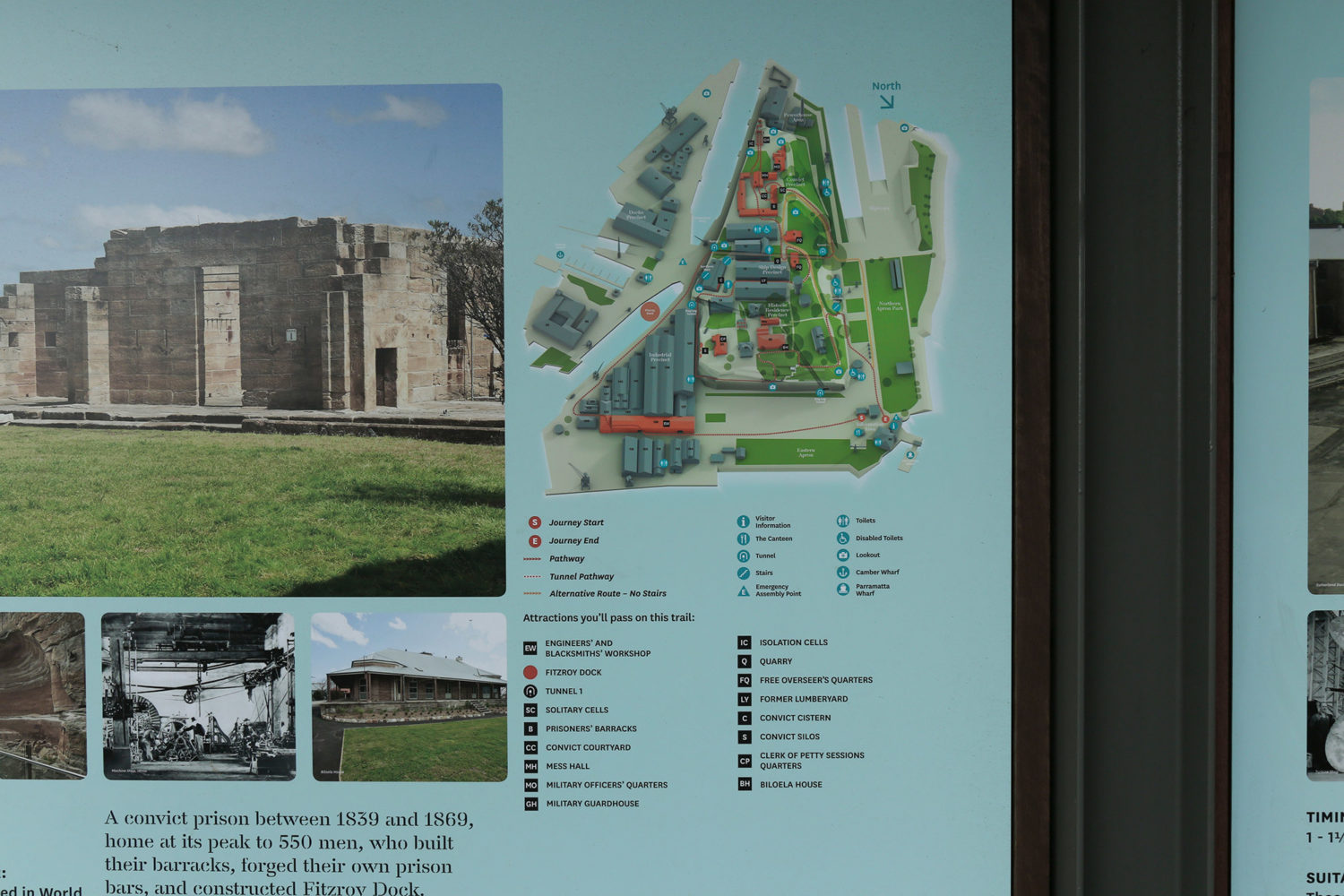
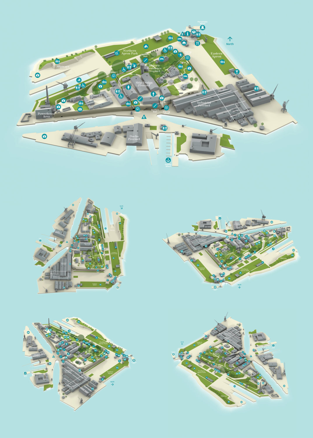
An important component of the project was redeveloping a new mapping system to help people traverse the island. As the island has varying relief, traditional 2D maps were less successful at communication. We modelled a 3D relief map using master plans of the site to give visitors a more illustrative understanding. With a highly detailed model of the island, we were able to reduce the key features to clear and simplified forms of distinctive landmarks such as cranes, escarpments, buildings and grassed areas. Through re-orienting the renders of the mapping according to the context of the view, each sign gives a context-aware view of a visitor's current position.
View our Cockatoo Island Rebrand project here >